Most of the Charts That I Like, Really Like This Market
An overview of some of my favorite signals: 9 out of 10 say "don't sell".

My basic investing tenet is that you should be in the market most of the time. That’s where the money is made. Don’t worry about normal ups and downs, don’t fret about a healthy degree of volatility.
At the same time, I don’t buy ‘buy-and-hold’. The secular bear markets of 2000 and 2008 made it pretty clear to me that 50%-90% drawdowns will happen, and these need to be avoided.
The decades-long bear market in Japan starting 1990, and the ruinous investment episodes of Russia from 1917 onwards, or Germany from 1943, were additional evidence that ‘buy-and-hope’ is for the lucky only.
Hence, I employ a small number of fixed-rule investing strategies that tell me when to buy which kind of asset, and when to sell. My occasional performance overviews sum these strategies up in a hopefully concise manner.
No strategy however is 100% safe, all the time. So, I have furthermore collected a number of sell signals.
Almost all of these rang a warning bell in 2000, in 2007 (or 2008), and in 2021 (or 2022). I use these signals as a fail-safe, and to get a general feeling for the market.
Even a fail-safe can fail, though. For instance, several of these signals underperformed in February/March 2020, when Covid hit our economies. And I suspect the crash of 1987 would also have over-taxed most of them.
Technical analysis aims to provide a snapshot of the collective investing psyche. However, when the collective stance is changing by the day or by the hour, yesterday’s chart is as good a forecasting tool as yesterday’s newspaper.
Some of these signals are a little trigger-happy, and sounded the alarm in 2011 and in 2015, for instance. Hence, I don’t sell everything just because one indicator is flashing a red light — I just employ more caution, and less leverage.
Please note these signals are for selling, and not necessarily for buying. For instance, the XLP:SPY ratio is reliably cautious in bad times, but does not always provide a green light when things have begung to look up. “Risk-on” is quite another story… for another blog post.
Here we go, in no particular order!
1) SPY MACD monthly crossover
“When in doubt, just zoom out” is a motto I find quite useful. So, taking a monthly (instead of daily) look at the momentum indicator MACD (“moving average convergence/divergence”) works for me:
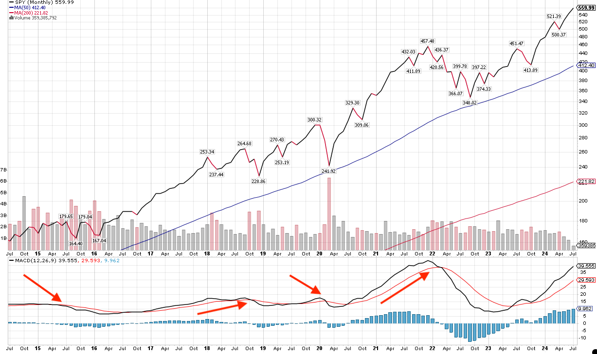
Take a look at the red arrows that I inserted. They show where a significant MACD crossover happened. This is a a signal that worked in 2015, late 2018, in early February 2020, and in March 2022. It doesn’t indicate any danger whatsoever right now.
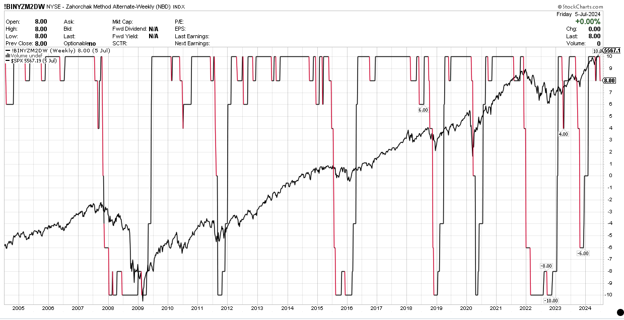
2) Zahorchak
I have written about this in the past. We need to look at crossovers from -10 to +10 (good news), and vice-versa (= danger ahead!)
We’ve been good since early 2023. Very little sign of anything bad coming up.
3) Long-term Bollinger Bands
If you said this one is a little bit too relaxed, well, I wouldn’t really protest. I’d use it to identify a crucial danger, leading to a sell, when the SPX plunges through the dotted line, as it did in 2001. Same thing in 2008.
In all the other years, it was something of a “don’t worry be happy” signal — it wouldn’t have indicated risk-off in 2011, 2020 or in 2022.
It may be rather relaxed, but using this signal, you would have sold your assets before the really damaging market crashes. Sometimes, the important thing is to avoid the psychologically dangerous zone of “OMG, I lost 60%, I now have to sell everything before I lose 90%!” Which is often tantamount to selling at the bottom.
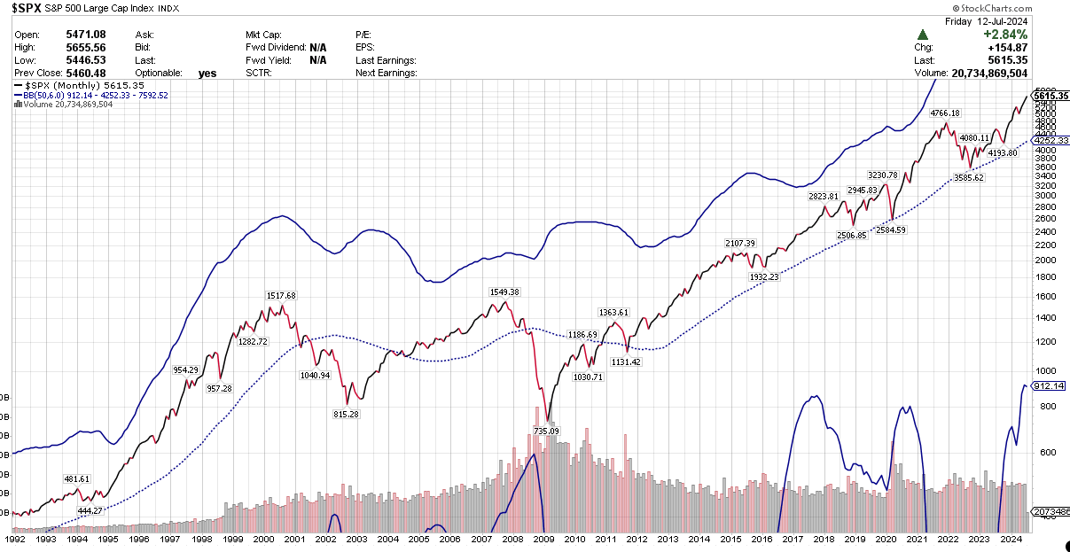
You can use this signal or leave it be, but please note it is saying the present-day market is (obviously) not showing any crashiness, but also seems to say we are not in exuberant-market territory, even though we are a little 2021-ish, and slightly reminiscent of Y2K. But not toppy enough to create sleepless nights, as far as I can tell.
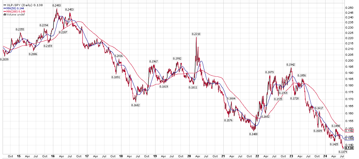
4) XLP:SPY
Chris Ciovacco recently pointed out how the ratio of defensive stocks (ETF: XLP) to the broad market is a good early indicator of stock market troubles.
I agree; the 50/200-day moving averages of this signal indicated a sell in 2000, 2007, 20011, 2020 and 2022.
However, it is a somewhat trigger-happy signal that, if you relied on it to 100%, would have led you to sell in 2006, 2007, 2014, and 2018. Be that as it may — it isn’t telling us to do anything right now. On the contrary, things are looking very safe!
5) Junk Spreads
This indicator speaks to how risky the market is perceived to be by options and bond professionals. Beware when the jumpy dark line is above its blue 200-day moving average.
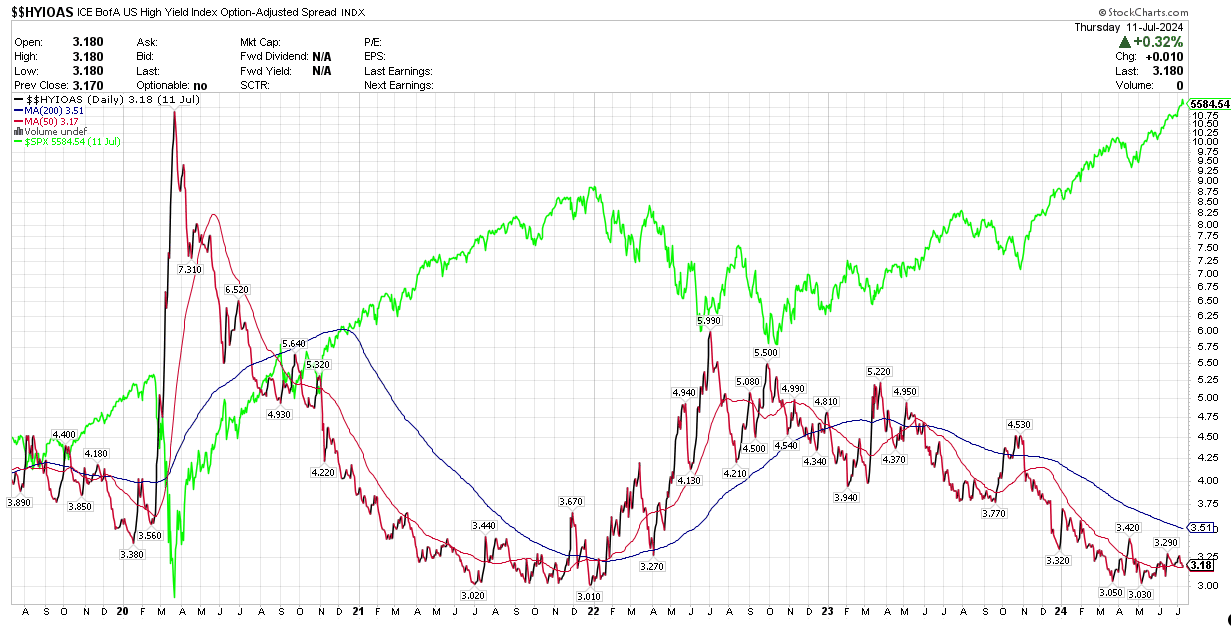
(Sorry for this garish colors on this chart; the green line indicates the S&P500).
As so often, I find the 50/200 crossover of the junk spread line more useful than its actual daily position. Looking back ten years, I see clear crossovers in September 2015, November 2019, March 2020 (which was too late, unfortunately), and January 2022.
Once again, in the present time, we are nowhere near a danger zone. As with all the signals I’m writing about here, I’ll let you know when this changes (if you’re a subscriber. If not — smash that button!)
6) Long-term sentiment
The hypothesis behind this indicator is that the aggregate sum of professional investors goes through long waves of both positivity and negativity.
Collectively, they become too positive in period of irrational exuberance, and in contrast, overreact in the dark night of a bear market.
In positive times, investors purchase too little insurance (this is what this chart intends to show) against a falling market. And again, the contrary happens during times of market stress: crash insurance comes at a considerable premium. All this is priced into the put/call ratio, as illustrated on this chart:
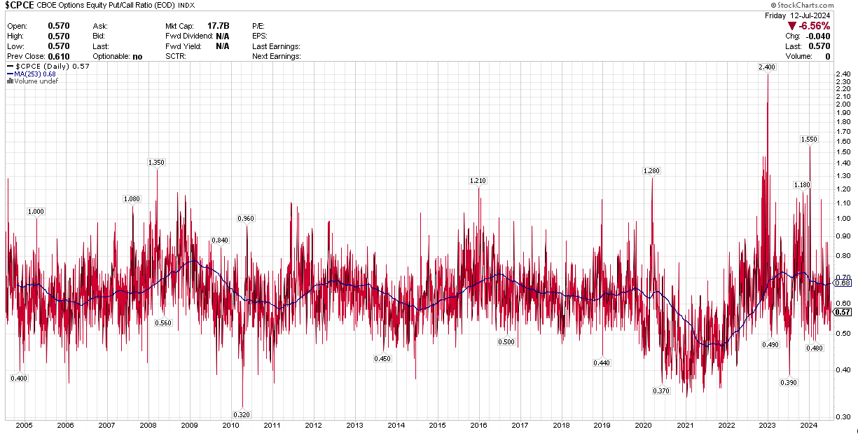
Look at the solid dark line, which indicates the long-term average of sentiment (as opposed to the short-term red oscillations). High readings of 70 and above (as in 2009, 2016 and 2023) mean market participants have been on average quite fearful for a considerable length of time. Given enough time (and enough fear), all the sellers will have sold, after which a new bull market can begin.
Low readings (case in point: 2021) mean that there has been very little fear in the market for quite some time. Hence, everybody is invested, including the shoe-shine boy and his cousin. Now, what happens when there is nobody left who is buying? Exactly: a seller’s market, aka a bear market.
Looking at this chart, there is little reason to believe the current bull market hasn’t got a long way to go. We’re not at all near 2021 territory!
7) Coppock Curves
As per Investopedia, the “Coppock Curve is a long-term price momentum indicator used primarily to recognize major downturns and upturns in a stock market index”.
Once again, for me, it’s about the crossovers. COPP=0 is what you need to look at here. When we make a strong crossover either upwards or downwards, this is significant.
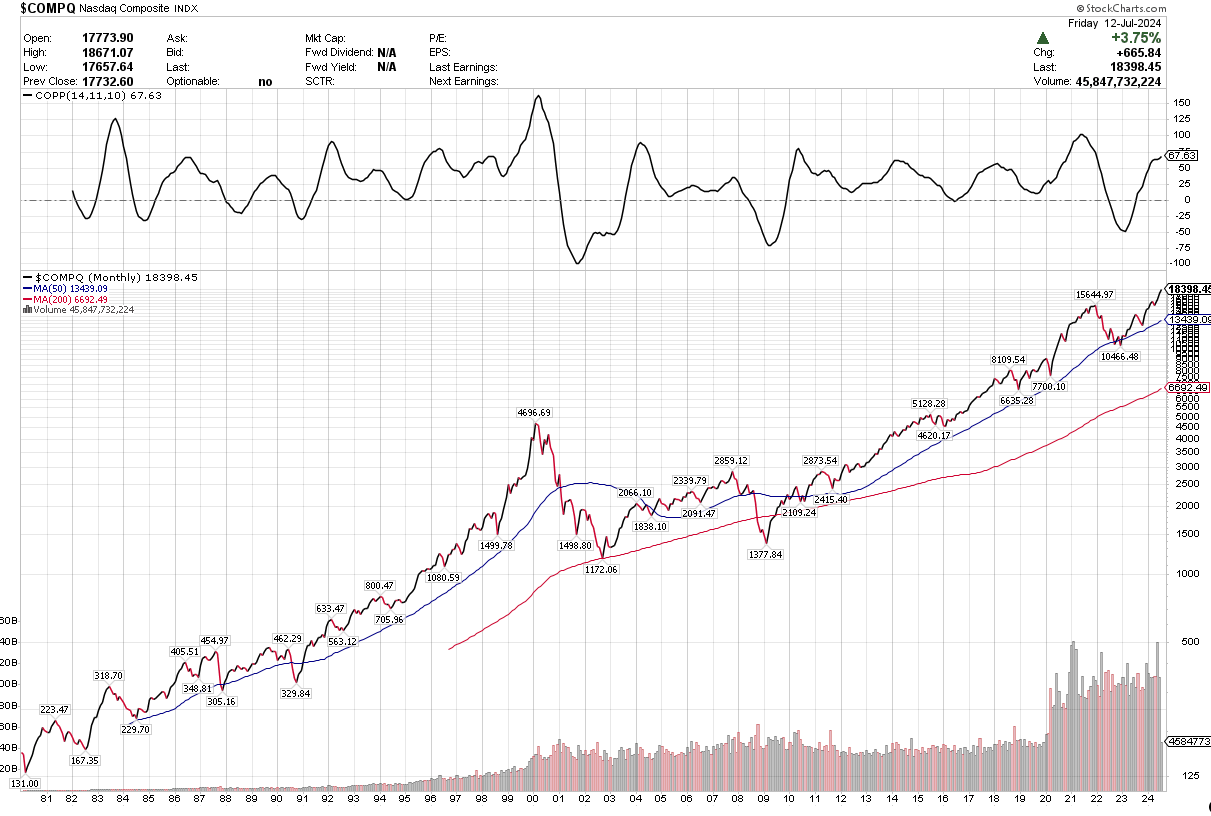
Downwards crossovers which meant risk-off: In 2001, 2008, and 2022.
Going upwards, which tells you to go ahead and buy: In 2003, 2009, and 2023.
If you’re looking for a simple and unambiguous signal which is not influenced by everyday volatility, then here you go. Big caveat however: this indicator is not always exactly timely. By the time Coppock told you to sell the Nasdaq in January 2001, the music had clearly already stopped playing, even though some of the party guests were still standing around the punch bowl.
Speaking of 2001: Our current position on the Coppock curve looks nothing like it. No crossover in sight.
The Coppock curves of the NYSE and the SPX also tell interesting stories. If you’re interested, let me know, and I’ll make a separate post for these.
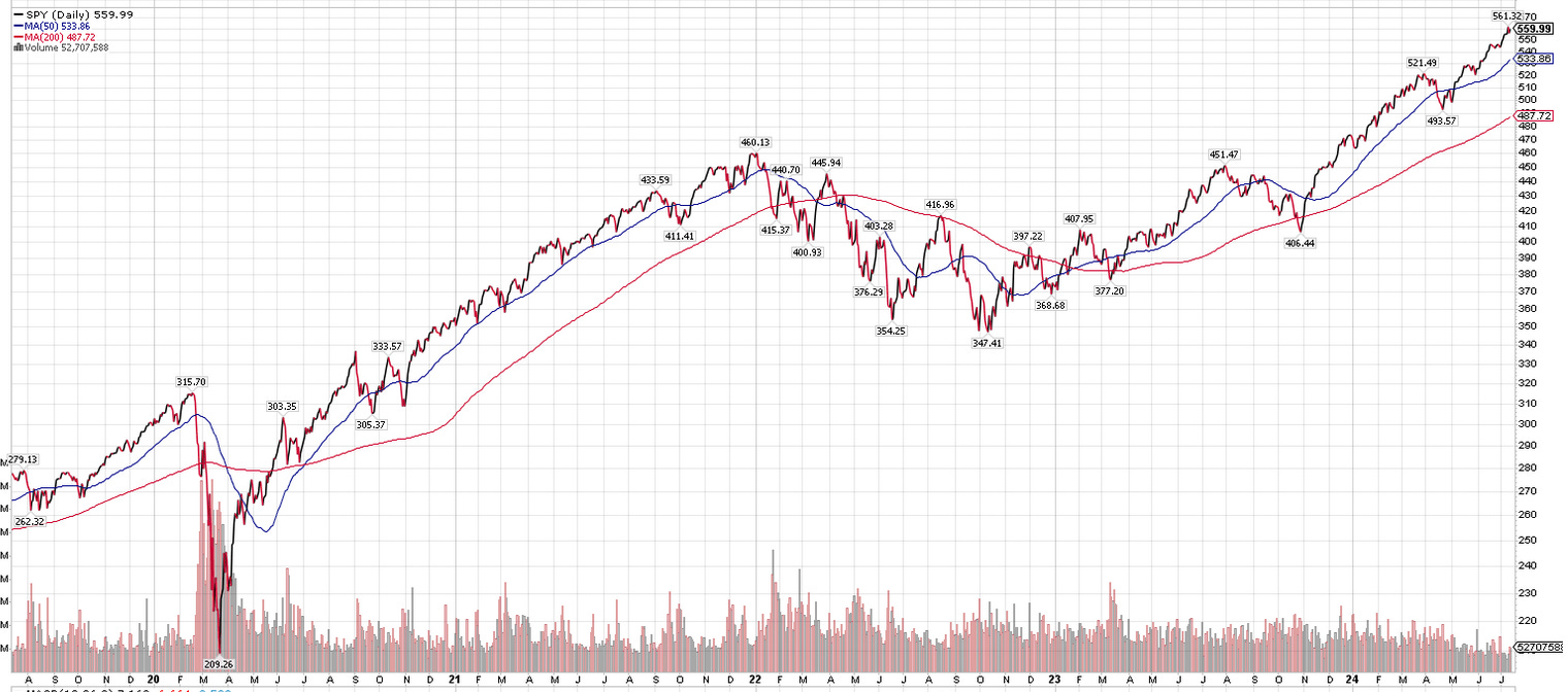
8) Bill Sadek’s Percentage Bands, and the Golden Cross
Bill developed a simple timing scheme whereas you sell the stock market when it crosss under its 200-day moving average by 5% or more. Concurrently, you buy stocks when they rise 3% above their 200-day moving average.
On this chart, it would mean selling the S&P 500 at the lower blue band, and buying at the upper green band. (You can disregard the other bands).
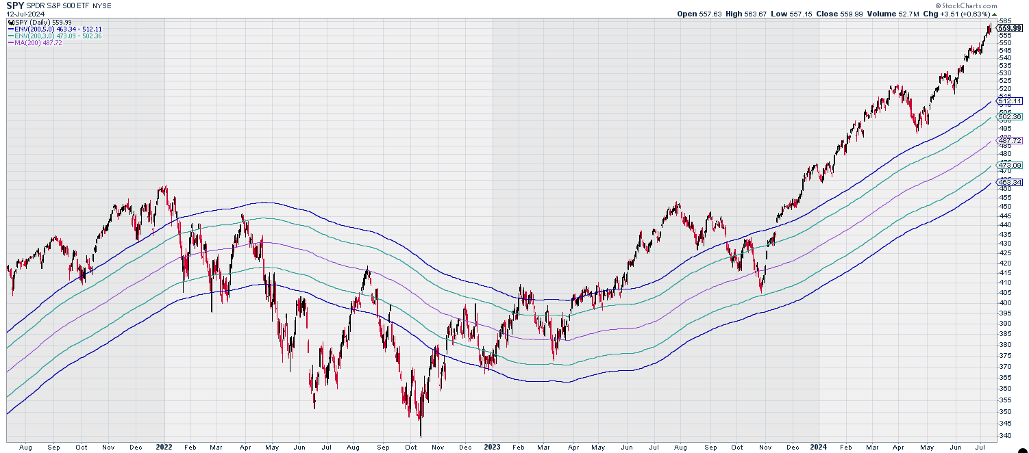
I have written in the past how reasonably well this extremely simple method works at reducing risk while preserving most of the gains an investor can hope to make. You’re not selling or buying particularly early and by no means at the very best point in time, but you’re stepping away from the most dangerous booby traps.
(Case in point in regards to the above chart: we would have sold in February 2022, got whipsawed a bit, sold again in May, and re-entered the market in a timely fashion in late January 2023, not having looked back ever since).
This is an element of the “5% Canary” strategy that I have designed, and about which I have written often in the past. Suffice to say that for the moment, we are quite a distance from that ‘minus 5% trigger’ point. As a matter of fact, it would take quite a waterfall crash, a hot-knife-through-butter kind of panic, to reach that trigger point within the next one or two months.
Same for the Golden Cross:
It’s even simpler, more symmetrical than Sadek’s 3% / 5% rule: you buy the stock market on its 50/200-day moving average crossover going up; you sell it at the crossover going down.
It has been claimed this is a fool-proof method of investing, but I debunked that. No matter: even though this momentum-based rule sometimes (as in 2020) goes rather wrong, it is on average reasonably reliable, low-stress and quite effective.
And yes, the Golden Cross also says there is no “sell” signal in sight. This signal told us to buy stocks 17 months ago, which we would have been holding ever since, for very good gains.
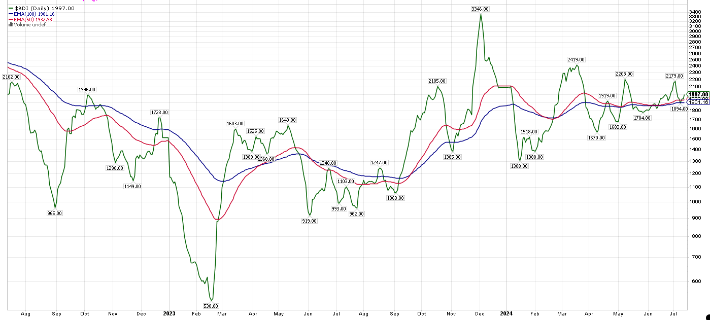
9) The Baltic Dry Index
The BDI — the index of international bulk shipping prices — is pretty good at sniffing out any danger to the world economy. It started crashing in October of 2019, well before most indicators warned us of the Covid crash, and did the same thing in November 2021, at a time when most people (like me) were not expecting inflation to be the major negative stock-market issue it turned out to be.
Looking back longer-term, it has a mixed record, about which I have written here.
Nonetheless, I like to take a close look at the BDI on a regular basis. Which reveals: it has been bullish since the second half of September 2023. (That call was early by six weeks, which leads to the question: is this anteriority a feature, or a flaw? However, my post was on the dot.)
10) And finally, some not so good news (not actionable, though)
Tom McClellan has posited some weird theories over time, but to my mind, this one is pretty intriguing. He claims the Federal Reserve is actually superfluous. At the end of the day, interest rates are determined by the 2-Year US Treasury Yield; the Fed usually just follows.
Which, according to this theory, explains both bubbles, and recessions. Namely: if the Fed is late in following the 2-Year downwards, by lowering interest rates, a recession happens. And conversely, you get a bubble when the Fed is too loose.
Here’s a chart that combines the 2-Year, and the Fed Rate. Annotations are mine:
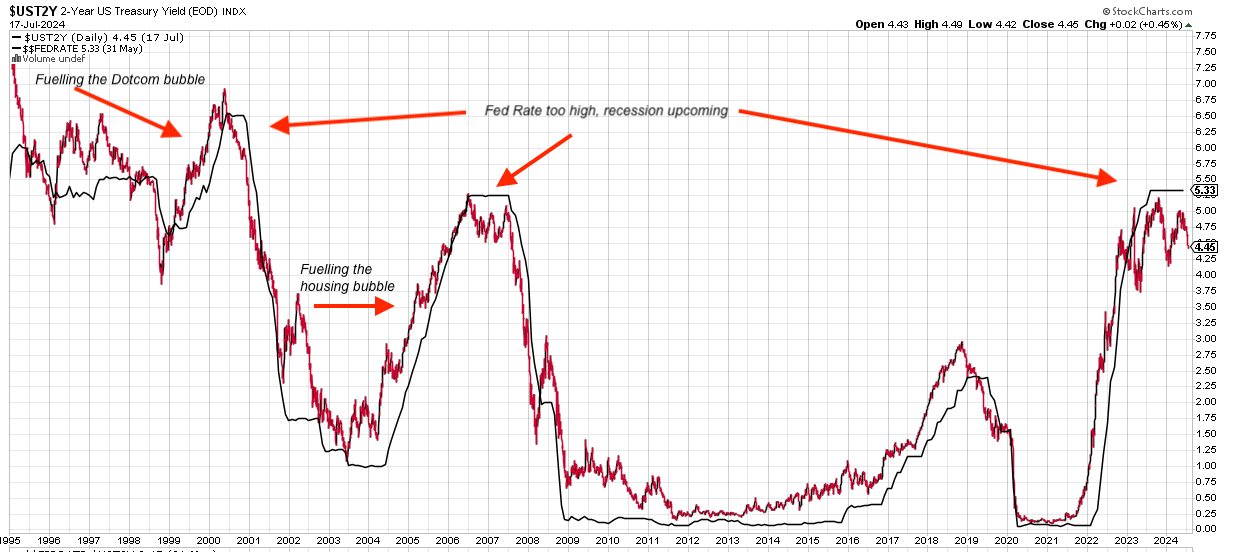
This chart would claim that both the Dotcom bubble and the pre-GFC housing boom were caused by a too loose Fed rate, which then went to pot when the Fed not only tightened, but stayed too tight for too long. According to this interpretation, first the Fed was asleep at the wheel, and then when it woke up, it over-corrected and over-tightened, as it were.
Looking at the chart, one might conclude that “too tight for too long” causes a recession in not much longer than two years time.
Finally, you might say we have been in an era of overtightedness since around Q2 2023. So, no later than sometime next year, we are due for a recession.
Does this matter right now, in July 2024? Not really. But let’s keep an eye on it!
What do you think?
Thank you for reading this long and complicated post till the end.
You may have some questions about these charts. I refrained from explaining or analyzing them in detail, because I wanted to keep this post as short as possible. Feel free to pose any question that’s on your mind, and I’ll do what I can to answer!
Let me know if you disagree with any or all of this. I am here to learn. Also, if you are particularly interested in any one of these signals, I’ll be glad to follow up in a further post.
QuantMage adaptation of Bill Sadek's Bands: https://quantmage.app/grimoire/2189ec605691d29ddb770317a57b79d2
Pretty good!
Excellent post Martin!
Other good market timing tools from David Keller: https://stockcharts.com/articles/sharedcharts.php?cc=1631730 (He's very good!)