
Be Prepared to Sell Everything (...But Only Once Or Twice a Decade)
Be Prepared to Sell Everything (...But Only Once Or Twice a Decade)
Introducing a strategy of "Benign Neglect"

Buy-and-Hold, in other words the investing principle according to which you never sell your assets, works wonderfully, most of the time. Just look at this chart illustrating the S&P 500 from the period of 1995 to 2022. It shows a fantastic annual growth rate of 17.5%. Invest $100, get (after 27 years) $4100!

OK, you’re obviously not stupid and you noticed that this is a cack-handed manipulation of a chart. Namely, it excludes the crucial (and miserable) year 2008, as well as the anni horribiles 2000-2002, and also the late unpleasentness of 2022. Here’s the original version:
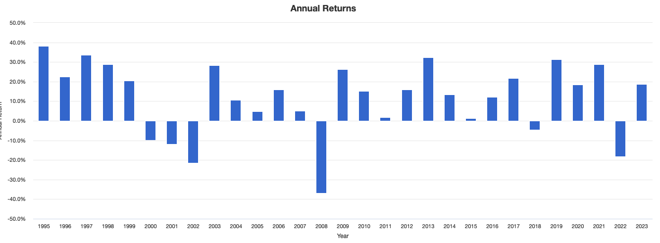
My point obviously being: if you could somehow manage to be in the market in the good years, and stay out in the bad, you’d likely profit very well indeed.
In contrast, just staying invested according to the maxim of buy-and-hope earned a whole lot less: around 10% p.a.. But more importantly: during that time, your investments suffered truly terrible drawdowns of over 50%.
This blog post has the premise that it probably makes sense to stay invested most of the time — but not all the time. I’ll investigate different approaches to selling only at crucial moments. And at the end, I’ll suggest a concoction of my own.
Buying and selling according to the Golden Cross
Golden Cross/ Death Cross investing is an ancient (probably developed by Japanese rice traders) way of determining a market’s trend. When a market’s 50-day moving average is above its 200-day moving average, it’s in bullish Golden Cross territory. The opposite, a Death Cross market, is when the longer average is situated above the shorter average.
The S&P500 has been in Gx territory since late January 2023:

Using the Golden Cross as an investing tool actually isn’t so bad. From 1994 to end-August 2023, it ourperformed B&H on an absolute level: CAGR +10.05% versus 9.92%.
But what really makes the Gx superior is its risk-adjusted performance. During the same time period, the S&P500 went through drawdowns of -50.8%. Gx in contrast never recorded a monthly drawdown of worse than -19.43%. Buy and sell according to the Golden Cross, double your risk-adjusted returns!
While the lower drawdowns are psychologically great, on the contrary, there were several times when just staying invested was much better. This is a big problem: it’s difficult to keep using a system that occasionally does exactly the wrong thing.
Take 2020 for instance, the year of Covid (as if anybody needed reminding): As the Golden Cross is a slow moving, and therefore lagging indicator, it got everything wrong. It sold when the market was at a very low point, and took long to re-enter, hence underperforming simple staying-in-the-market in 2020 by over 20%. Talk about having a cross to bear…
Other years of serious underperformance: 1998 (-19%), 2003 (-9%), 2010 (-12%), 2011 (-5%), 2015 (-5%), 2016 (-12%), and 2019 (-14%). (All numbers are rounded). Serious bummer data.
Which helps explain why, despite its obvious advantages, Golden Cross investing has never caught on for the masses of investors. Accepting that you’re (on the face of it) a loser around one-fourth of the time takes quite some mental fortitude.
The Gx does a lot of futile buying and selling, especially during whipsaw markets. From 1998 onwards, it went to cash 14 times. Remember my fake chart from the beginning of this article? Its message was supposed to be: ideally, you would have been out of the market a mere three times: in 2001-2002, 2008, and 2022 — certainly not 14 times!
Bill Sadek’s 3% / 5% Bands
As generally acceptable investing according to the Golden Cross may be, I prefer Bill Sadek’s system. It manages to refrain from doing much of that buying and selling in whipsaw markets, as it only calls for action when stocks are seriously trending upward or downwards.
Simple rules: You buy the S&P500 when it is 3% above its 200-day moving average. You stay invested until the S&P500 goes 5% below its 200-day moving average.
On this chart’s example, the 200-day moving average is represented by the violet line in the middle. “3% above” is green; “5% below” is blue. (Please disregard that there are also “5% above” and “3% below” bands — they’re just a charting software flaw).

Sadek’s system sold the S&P500 at the red arrow, in late April of 2022. It re-entered the market at the blue arrow, in January 2023. And we’ve been invested ever since.
In practice, Sadek’s system is not so very different from Golden Cross investing. Transactions have a considerable lag before they are indicated by a moving average, which is good (in trendless markets). But this is also bad, when you have a hot-knife-through-butter situation, as was the case in March 2020.
CAGR and maximum drawdown values are roughly comparable with the Golden Cross system, as far as I can tell (Sadek’s calculations are not quite compatible with the CAGR and MDD data I get from the Portfoliovisualizer website).
He has quoted a CAGR of 10.27% from 1994 to February 2022, and a maximum monthly drawdown of -19.03%, both of which however I have not confirmed been able to verify (edited Sept 27 for clarity).
According to my observations, sometimes Sadek generates a slightly more timely signal; occasionally the Golden Cross performs better.
Where Sadek is superior however is in terms of transaction frequency. From 1998 to 2022, it generated only 10 sell signals: in 1998, 2000, 2008, 2010, 2011, 2015, 2018, 2020, and 2022.
This compares favorably with the 14 sells of the Golden Cross system, but still is not quite good enough, one might say. It would have been better to stay invested in the markets of 2010, ‘11, ‘15, and ‘20.
In contrast, the next system I will present only sold 7 times during the years of 1998 to 2023. Let’s take a look.
The Thrasher 5% Canary
I posted a short piece about this recently. Bill Thrasher’s ostensive discovery is that a bear market typically begins with a strong downdraft of at least 5% from highs, typically in 15 days or less.
You may remember the Brachistochrone curve from physics class? When you have balls going down different ramps, the ball on the curved ramp will be the first to arrive at the target, although the distance travelled is longer. Initial acceleration makes all the difference — as be it in physics, so be it in the stock market.
So the rule is this: if the S&P500 declines by at least 5% from a 52-week high within 15 trading days or less, this constitutes a 5% Canary. Which means: look out!
To be considered a proper sell signal however, the Canary in the market’s coal mine has to suffer from more than some shortness of breath — it needs to fall over. You get a “Confirmed 5% Canary” when the market closes under its 200-day simple moving average for two consecutive days — if this happens within two months, i.e. 42 trading days.
Since 1998, I noted 7 Confirmed Canary Signals: In 1998, 2000, 2006, 2007, 2010, 2020, and 2022. The only (unprofitable) “misses” were in 1998, 2006, and 2010.
The rest of the time, one could revel in the splendor of the S&P 500. Most of the fun, little of the pain!
Similarly to the Golden Cross, Thrasher’s Canary has a rather good long-term track record. For those of you who missed it, I quote from my previous piece:
Since 1980, there have been just 15 Confirmed 5% Canary signals in the S&P 500 and 14 Confirmed 5% Canary signals in the Dow Jones Industrial Average (…). Included in this sampling are the significant market events that were noted by the 5% Canary signals (…). This includes the Great Depression, 1987 Crash, bear market following the Tech Bubble of 2000, Financial Crisis of 2008, Covid Crash of 2020, and the bear market that began in 2022.
Of the 15 Confirmed 5% Canary signals on the S&P 500 sampling (…), only four did not occur ahead of what resulted in a double-digit drawdown for the index.
Since 1980, only one drawdown of -20% or more for the S&P 500 did not receive a Confirmed 5% Canary signal (the bear market of 1981-1982).
I find it noteworthy that the Confirmed Canary signal often comes months before the Golden Cross, or before Sadek says “sell”.
Remember how Bernard Baruch replied when asked how he made his fortune? “By selling much too early”.
An early signal also means you have an opportunity to scale into Treasuries, which are often good out-of-market assets.
Here’s my “Benign Neglect” investing strategy
I propose a long-term strategy that for most of the time is fully invested in the market — except when all hell is breaking loose.
In the words of Charles Ellis, “Benign neglect is the secret to long-term investing success”.
This is not a strategy for short-term traders. Neither is it suitable to folks who believe that risk-adjusted return is the only game worth playing. Instead, it ignores/embraces necessary volatility — such as we experienced in 2011, 2015, 2016, and 2018 -- as a inevitable prerequisite for making money in the stock market.
Since perfect timing is a chimera, you might as well accept (limited) drawdowns, as long as you make excellent gains!
But the Benign Neglect approach tries to avoid toxic volatility, i.e. the extreme drawdowns of 2001-2002 and 2008, which easily topped -40%.
Selling rule: Sell when a Confirmed 5% Canary is signalled.
Buying rule: Buy at Sadek’s level of “3% above the 200-day moving average band”.
Results from 1998 to end-August 2023:
the major, >40% drawdowns of 2001-2002, and 2008 have been eliminated
2022’s drawdown is halved, from -18.77% to -9.77%
four years end in negative territory, in contrast to Buy & Hold’s six negative years. Double-digit negative: BN=0, B&H=4
during 7 years, Buy & Hold performs considerably better (<5%), but in only one case does the relative poor performance of Benign Neglect lead to a negative yearly result
average yearly gains of Benign Neglect are slightly better (10.08% vs 9.57%), while the compounded yearly gains of Buy and Hold are marginally superior (due to recent outperformance, 10.2% vs 9.85%)

(Please excuse the European use of a comma instead of a dot in the above chart).
Nota bene: these returns would have improved (considerably) if our out-of-market asset was Treasuries, instead of cash. During the Dotcom crash for instance, intermediate-term treasuries easily earned 8.7% per year.
I have published posts about when Treasuries can be a usable safe asset: when they are in Golden Cross territory, and when inflation expectations are low. (Currently, neither apply — the world was sure different in 2001 and in 2008!)
Please let me know in the comments section what you think — is this a viable way to invest a portion of your assets with a look-away, no-more-nail-biting approach?
And please subscribe to my blog/newsletter if you would like to get free Action Alerts whenever it’s time to take a very close look at that 5% Canary!

Erratum: I originally somehow mis-counted the number of years that Benign Neglect ended in negative territory. Changed Sept. 24.
Great article, Martin!
Terrific article, Martin! On a risk adjusted basis, I have to believe the Benign Neglect is superior to “Buy & Hope”. The other element I reflect on is that we’ve been unbelievably fortunate over the past 40 years. For me, it is hard to envision the next 40 year are just as good. Maybe they are, but it pays to play good defense.